Our Experience
Experience that speaks for itself
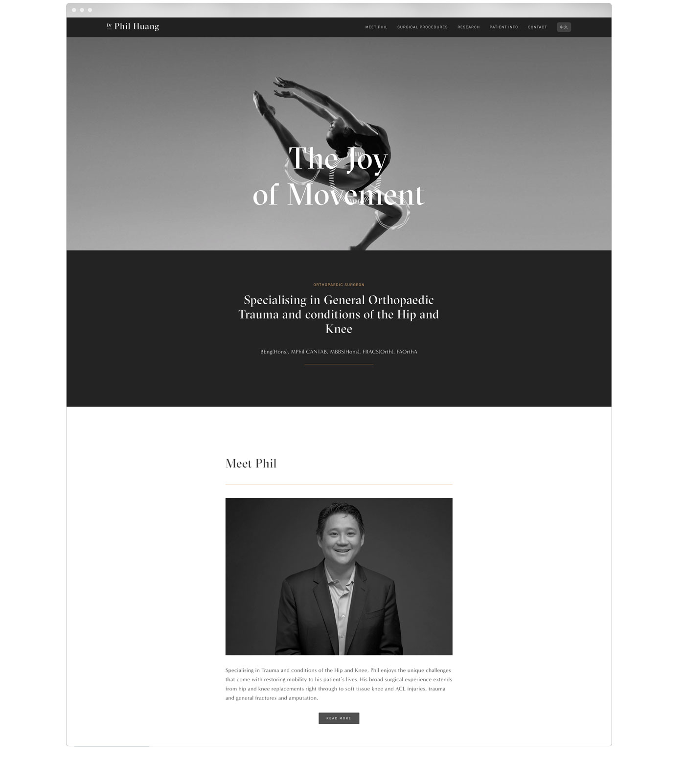
Every practice is unique and so is every website we create. From specialists to GPs to dentists and allied health professionals, we craft online experiences that feel seamless, professional and built with purpose. Explore some of our work and see how we bring medical websites to life.


& lots more...


Contact Us
Ready to get started?
A great website should be simple, professional and effortless to manage.
Let’s create one that works for your practice.